Designing a website with Spanish language learners in mind
WEB REDESIGN
2022
SIDE PROJECT
TEAM
PROBLEM
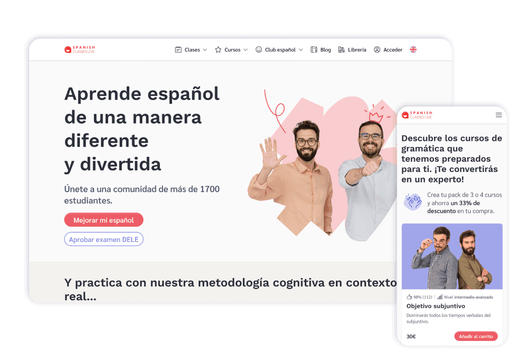
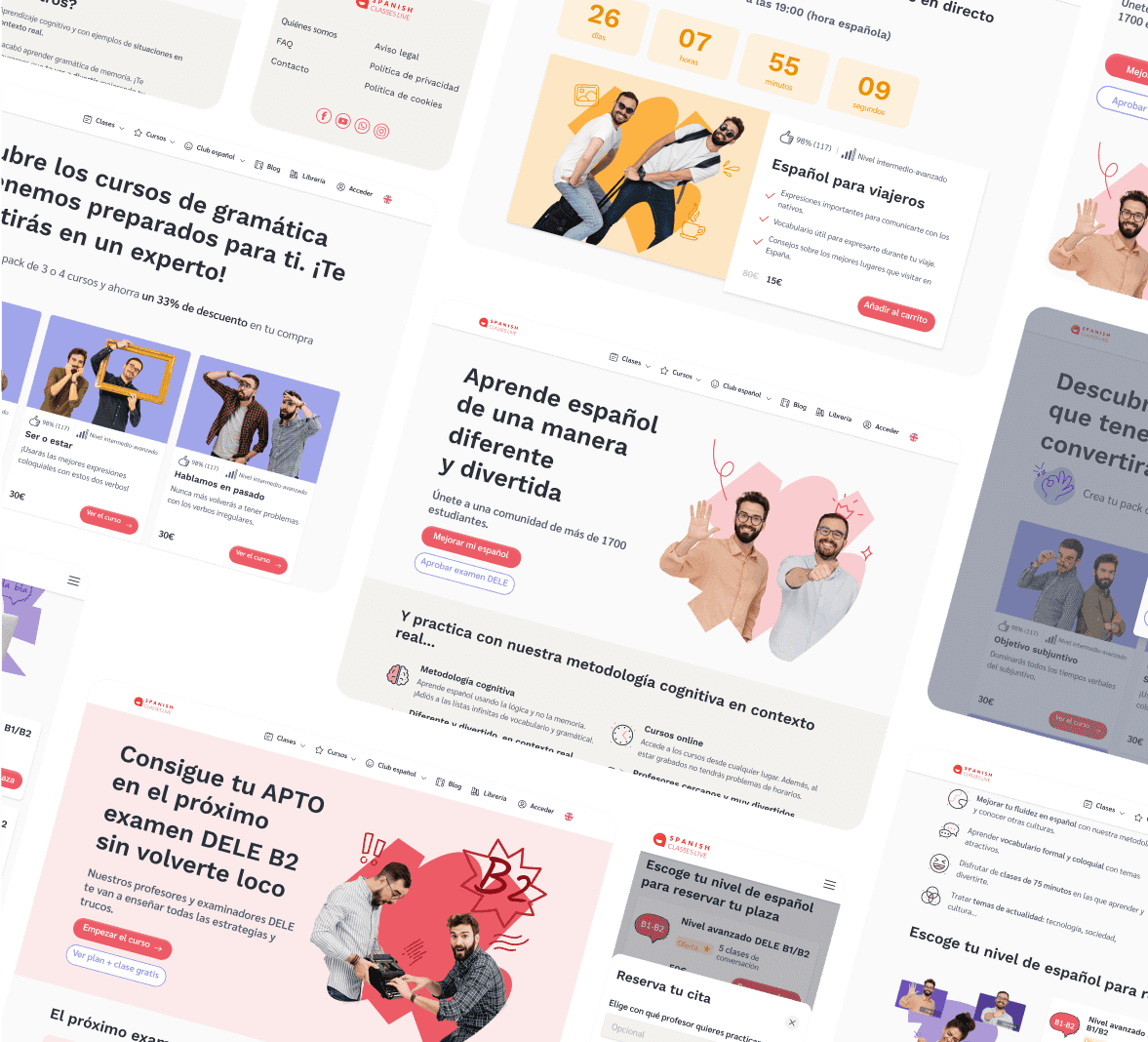
The problem to address is the redesign of a Spanish language teaching website that currently provides a poor user experience due to rough typography, confusing information, and a lack of clear call-to-action (CTA). Additionally, the website fails to reflect the company's unique and fun teaching personality and philosophy. The complex purchase flow and lack of trust are also challenges that need to be resolved.
SOLUTION
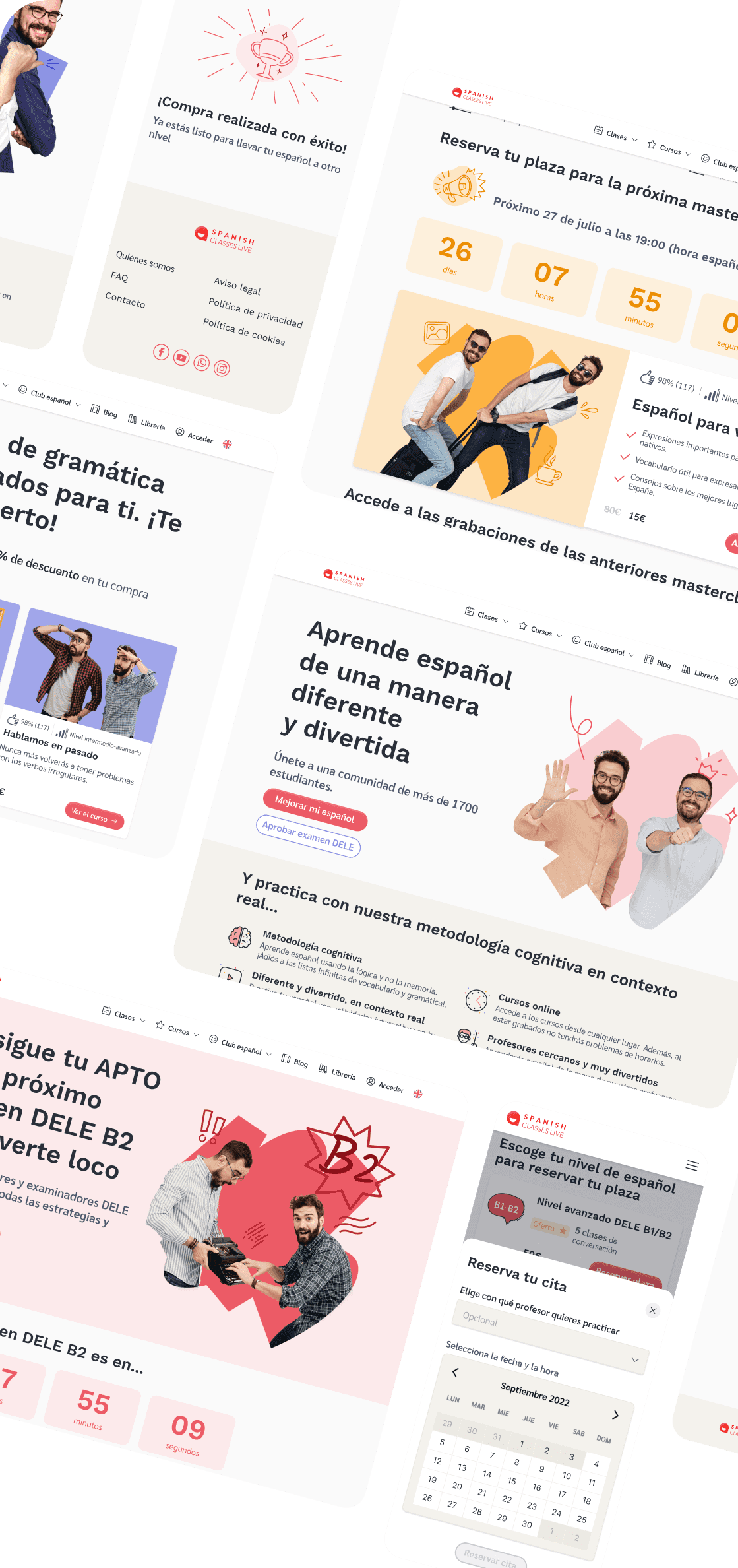
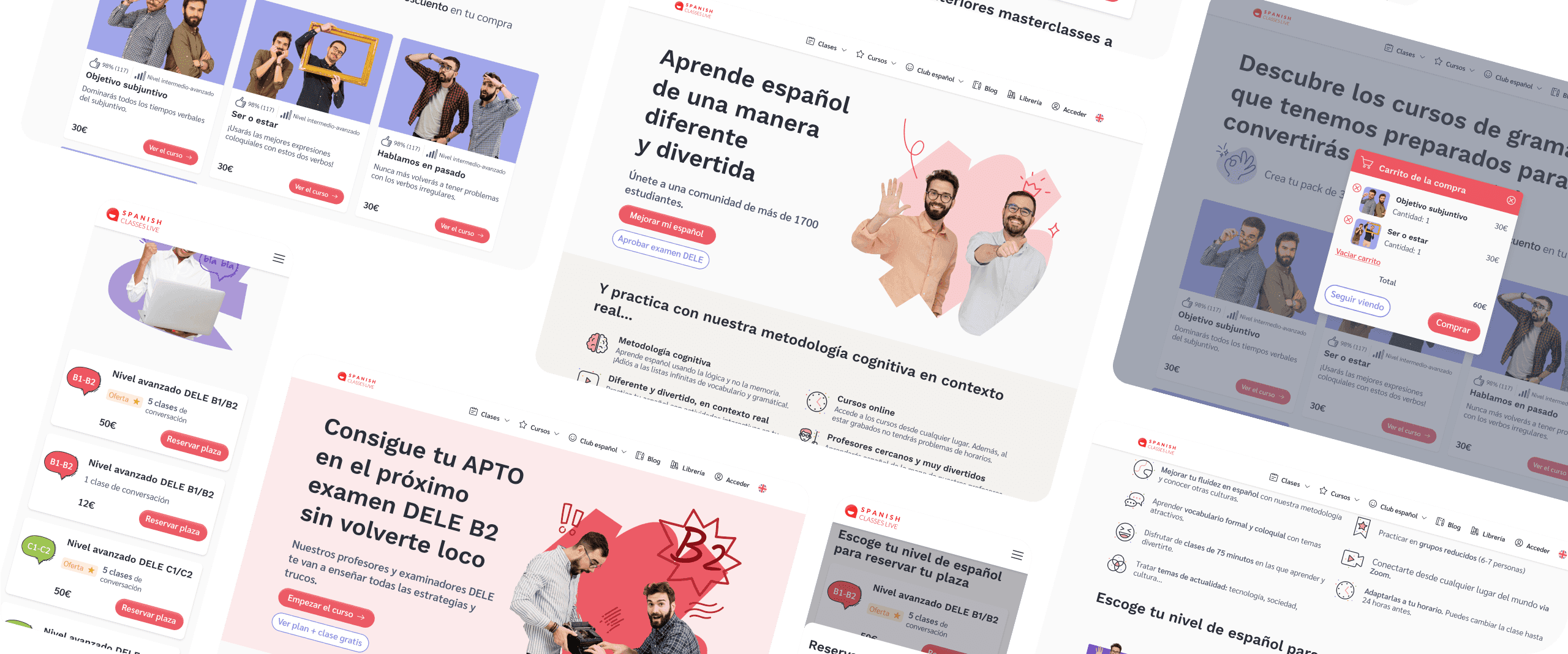
A visually coherent and appealing design with legible typography and a balanced color palette will be implemented. We will improve information organization, simplify the purchasing process, and highlight the importance of the teachers. These changes will provide an enhanced user experience, reflecting the company's unique teaching personality and philosophy.
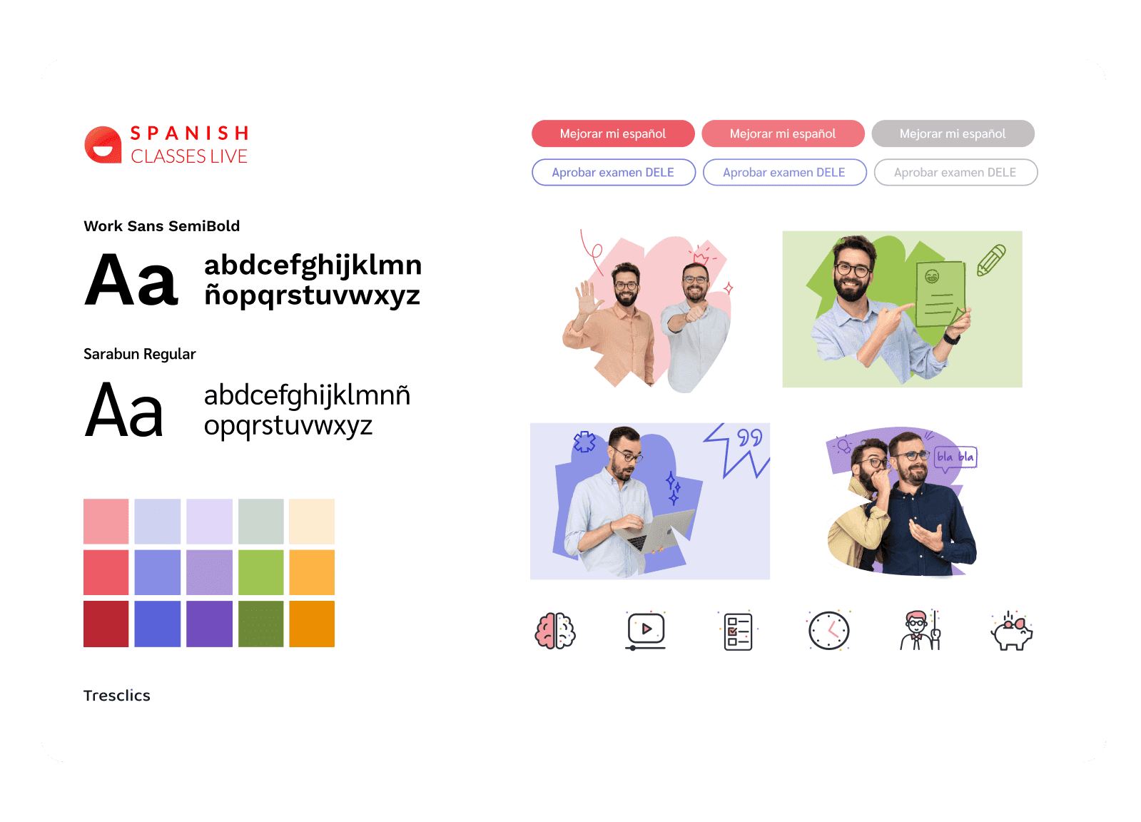
VISUAL IDENTITY
In our quest to convey the authentic personality of our teachers, we have embraced an approachable fun and dynamic approach. To achieve this, we have created a carefully curated palette of vibrant and diverse colors. Additionally, we have added touches of dynamism and enjoyment through colorful splashes, complemented by hand-drawn illustrations.
CHALLENGES
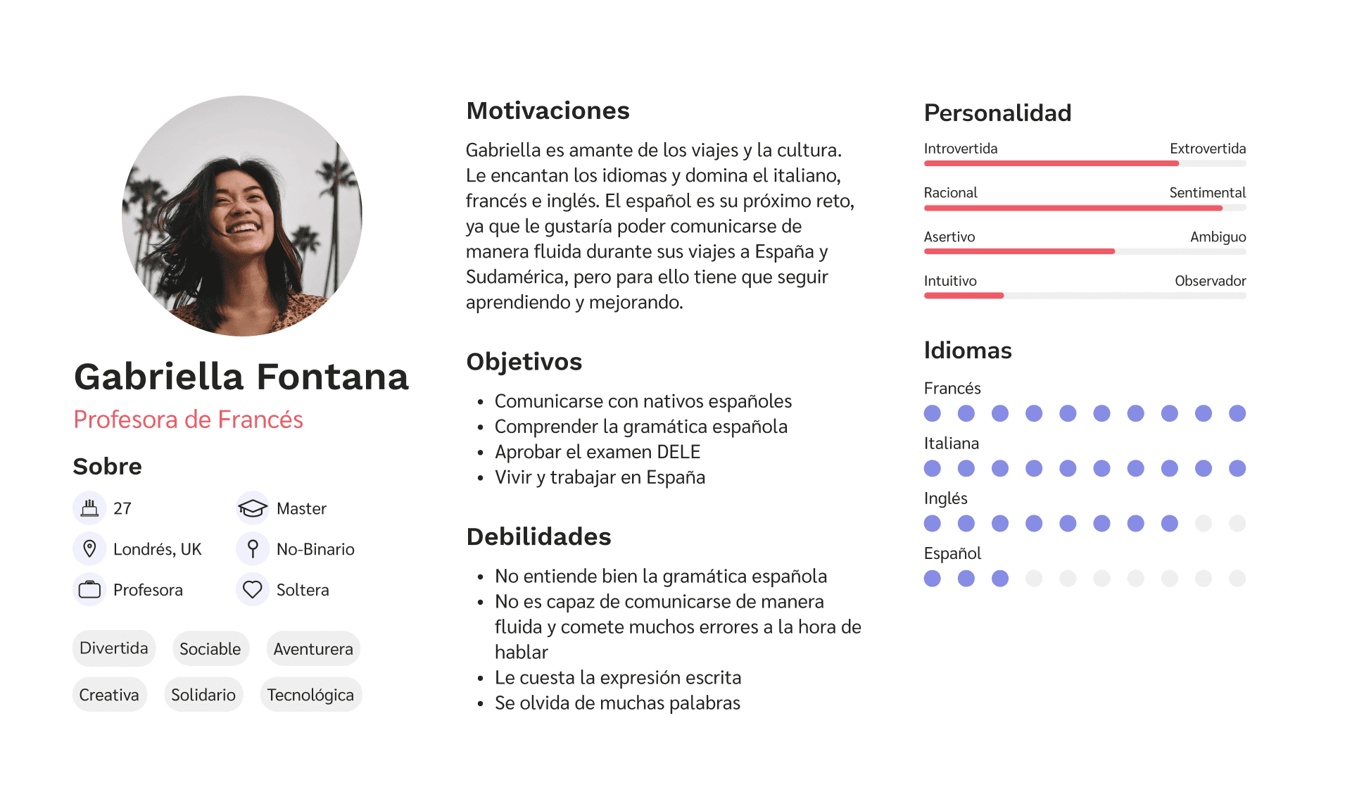
We faced a key challenge in this project: to reduce the amount of information that stakeholders wanted to include on the website, while striving to strike the perfect balance between their desires and the actual needs of the users.

Cristina Deniz: UXUI designer + visual design specialist

Laura Martínez: UXUI designer + Copywriter specialist

Laura Larrosa (me): Product designer + design system specialist